Top 16 Benefits of Responsive Web Design for Businesses
In today’s digital era, responsive web design has become the norm for any website. With the increasing number of people using mobile devices to access the internet, responsive web design has become a crucial aspect of website development.
What Is Responsive Web Design?
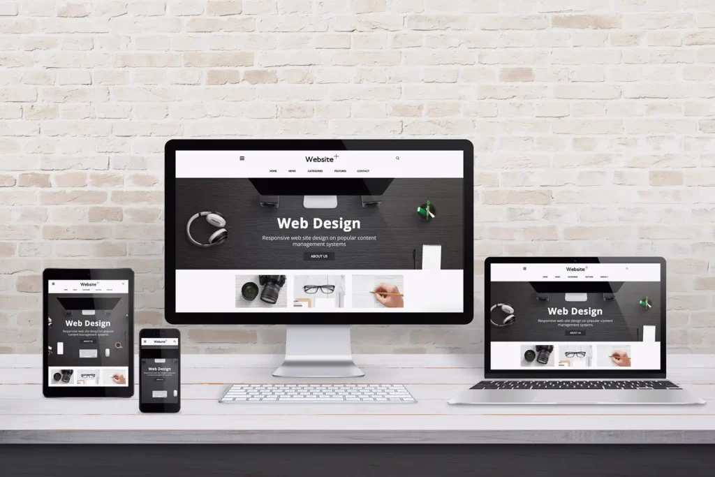
Responsive web design is an approach to website design that allows the website to adapt to different screen sizes, devices, and browsers. With responsive web design, a website is designed to provide an optimal viewing experience on all devices, whether it’s a laptop, tablet, desktop, or mobile.
Advantages of Responsive Web Design
1. Improved User Experience
A responsive design lets users easily access your website on any device, improving the user experience. Users can view your website from anywhere, anytime, without any difficulties. A responsive website ensures that users can easily navigate your website, read content, and interact with your website’s features, regardless of their device.
2. Increased Mobile Traffic
With the increasing number of people using mobile devices to access the internet, having a responsive design is crucial. It ensures that your website is accessible to all users, regardless of the device they are using. A responsive website will receive more mobile users, which can lead to more conversions and sales.
3. Easy to Manage
A responsive website is easy to manage because you only need to manage one website. With a responsive design, you don’t need to create a separate website for mobile devices. You can save time and money by managing only one website. Additionally, you don’t need to worry about updating multiple websites, which can be time-consuming and confusing.
4. Improved SEO
Google has stated that responsive web design is its recommended design pattern for mobile websites. It can improve your website’s search engine rankings because Google favors mobile-friendly websites. It will also improve your website’s SEO, increasing traffic and conversions. Additionally, with only one website to manage, optimizing your website for search engines is easier.
5. Cost-Effective
A responsive website is cost-effective because you don’t need to create a separate website for mobile devices. You can save money and time by managing only one website. This means you can invest more resources in other business areas, such as marketing or product development.
6. Future-Proof
A flexible site is future-proof because it can adapt to new devices and technologies. With a dynamic website, you don’t need to worry about creating a new site every time a new device is released. A mobile-friendly platform can adapt to new devices, so your site will always be up-to-date. In the long run, this can save you time and money, as you don’t need to constantly update your site to keep up with new technology.
7. Improved Conversion Rates
A responsive website can improve your website’s conversion rates. With a responsive website, users can easily navigate through it, read content, and interact with your website’s features, regardless of their device. This means they are more likely to convert, whether by making a purchase, filling out a form, or signing up for a newsletter.
8. Better Brand Image
A versatile website can improve your brand image. An adaptive site shows your business is modern and up-to-date with the latest technology. Additionally, it maintains a better user experience across all devices, which can help reinforce your brand image.
9. Competitive Advantage
An optimized site can give you a competitive advantage. With more and more people using mobile devices to access the internet, having a device-friendly website can set you apart from your competitors. It can help you attract more customers, increase traffic, and improve your website’s conversion rates.
10. Faster Loading Times
A streamlined site can offer faster loading times compared to a non-optimized one. A responsive layout is created to load swiftly on all devices, regardless of screen size or resolution. Faster loading times can improve user experience and reduce bounce rates.
11. Lower Bounce Rates
A responsive site can experience lower bounce rates compared to a non-optimized one. This is because a seamless layout provides an ideal viewing experience across all devices, encouraging users to stay on your site longer. Lower bounce rates can increase website traffic and enhance search engine rankings.
12. Increased Social Sharing
A responsive website can lead to increased social sharing. With a responsive website, users can easily share your website’s content on social media platforms, regardless of their device. This can lead to increased website traffic and improved search engine rankings.
13. Improved Accessibility
A responsive website can improve accessibility for users with disabilities. With a responsive website, users with disabilities can easily access your website on any device, enhancing their user experience. Additionally, a responsive website can help you comply with accessibility standards, which can be important for businesses in certain industries.
14. Improved Analytics
A responsive website can provide improved analytics. You can track user behavior and engagement across all devices. This can provide valuable insights into how users interact with your website and help you make data-driven decisions to improve your website’s performance.
15. Easier Maintenance
A responsive website can be easier to maintain compared to a non-responsive website. With a responsive website, you only need to manage one website, meaning you only need to perform maintenance and updates on one platform. This can save you time and resources, allowing you to focus on other aspects of your business.
16. Increased User Engagement
A responsive website can increase user engagement. Users can easily interact with your website’s features with a responsive website, regardless of their device. This can lead to increased user engagement.
Transform Your Site with Decisive Design’s Responsive Solutions
A responsive website provides an optimal viewing experience on all devices, improves the user experience, and can increase traffic and conversions. A responsive website is easy to manage, cost-effective, and future-proof, making it an ideal choice for any business. With so many benefits, it’s clear that using responsive web design is a must-have for any business.
Are you looking for the best web design in Plano to boost your online presence and grow your business? At Decisive Design, our experts specialize in creating responsive websites that attract and retain customers. Contact us today!